
New pose for the horse. I tried to make the collar look less loose.


Cartoons!
The design is a bit confusing, but very original, but you should tweak the major designs a bit.
*agreeing with calad*
I actually like this.A little late to the party:

The Phantom of the opera wrapped inside of a haunted cuckoo clock.
I wanted something that looked like it would battle with a "peekaboo scare tactic" approach.
Animations and the usual affairs to come.


Sorry, Diinbong, if you prefer the design that way. But their are many new designs coming and ths one ain't sticking around.This is, in my opinion, the best design. In all honesty I like the masks as they were.

I think it's sweet how one trip to photoshop will all of a sudden move everyone's attention. I thank you all very much for your support. I added Eyes, a mouth (that is stationary, since it's a mask) and expressions to the false faces. also, a last minute smudge 'o the ankles.

More criticism please! Should I include a triangular nose? The design is sort of straying from a fox... so... yeah...
I still like your concept the most. While I did like the black color of the 2nd edition that you made, I like the full purple just as much.New pose for the horse. I tried to make the collar look less loose.
Awesome Caladbolg!
New Design: Kruger Imp
I totally agree with Doug.DougJustDoug: Calad's artistic awesomeness cannot be contained to a single design...
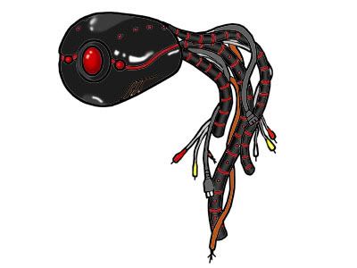
Looks very good, but the wires make me think its more of a Ghost/Electric than a Ghost/Steel.Color is done... for now...
Thoughts?


