I think you missed the 5 on your keyboard. I for one think that Gen 1's janky sprites are charming.We can agree that Gen 1 (Pokemon Red and Blue) had the worst Sprites of all of Pokemon and created by Game Freak lolol

-
Welcome to Smogon! Take a moment to read the Introduction to Smogon for a run-down on everything Smogon, and make sure you take some time to read the global rules.
-
Congrats to the winners of the 2023 Smog Awards!
Worst Pokemon Sprites?
- Thread starter Rankumander
- Start date
Bro, almost Half of them are Ugly.I think you missed the 5 on your keyboard. I for one think that Gen 1's janky sprites are charming.
Nah, they're just off model. There's a difference.Bro, almost Half of them are Ugly.


These are ugly. They're uncannily stiff and robotic, and are star examples of why distorting low-res images is a recipe for grainy disaster.


These are off model. They're exaggerated, stylized caricatures. If Pokemon are taken to be real creatures and not cartoons, Gen 1 sprites were cartoon depictions of them.
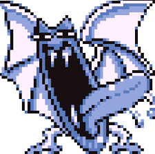
For Example, That Golbat sprite is going to give me NightmaresNah, they're just off model. There's a difference.
These are ugly. They're uncannily stiff and robotic, and are star examples of why distorting low-res images is a recipe for grainy disaster.
These are off model. They're exaggerated, stylized caricatures. If Pokemon are taken to be real creatures and not cartoons, Gen 1 sprites were cartoon depictions of them.
Exactly! When you're not constrained by a model sheet, you can bend and twist characters into poses that do a much better job selling a particular emotion than if it was 100% accurate.For Example, That Golbat sprite is going to give me Nightmares
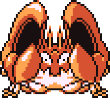
Golbat is a creepy, kinda gross Pokemon that sucks blood until it's too heavy to fly, so they gave it a big lean, squinted its eyes, and slobbered up that tongue. I absolutely would not want to meet this thing, and that's exactly the point.
Blastoise is a literal tank, absorbing blows with its armored shell and dishing them out with its water cannons, so they bulked it up and drew its head from a low angle looking down, giving Blastoise the feeling of being large and in charge.
Ok then, I guess your on to something..Exactly! When you're not constrained by a model sheet, you can bend and twist characters into poses that do a much better job selling a particular emotion than if it was 100% accurate.
Golbat is a creepy, kinda gross Pokemon that sucks blood until it's too heavy to fly, so they gave it a big lean, squinted its eyes, and slobbered up that tongue. I absolutely would not want to meet this thing, and that's exactly the point.
Blastoise is a literal tank, absorbing blows with its armored shell and dishing them out with its water cannons, so they bulked it up and drew its head from a low angle looking down, giving Blastoise the feeling of being large and in charge.
I might play RBY for fun
Heard from my friend it was centralized and simple, that sounds like a metagame for me :-)Ok then, I guess your on to something..
I might play RBY for fun
Man, my first game was Red. I grew up with those sprites. They're my childhood and bursting with nostalgia.
And they're fucking awful. Half of them don't even look like the Pokémon they're supposed to be.
It wasn't even a limit of technology. Yellow fixed up most of these and Gold / Silver had pretty good sprites. Imo 5th gen had the best sprites because unlike the terrible static, unmoving bricks of previous gens at least these had idle animations and something resembling a battle camera. I think gen 5 is overrated but one thing they actually nailed was the sprite based battle system.
Thats p true lulMan, my first game was Red. I grew up with those sprites. They're my childhood and bursting with nostalgia.
And they're fucking awful. Half of them don't even look like the Pokémon they're supposed to be.
View attachment 394028View attachment 394029View attachment 394031View attachment 394032View attachment 394033View attachment 394034View attachment 394035View attachment 394036
It wasn't even a limit of technology. Yellow fixed up most of these and Gold / Silver had pretty good sprites. Imo 5th gen had the best sprites because unlike the terrible static, unmoving bricks of previous gens at least these had idle animations and something resembling a battle camera. I think gen 5 is overrated but one thing they actually nailed was the sprite based battle system.

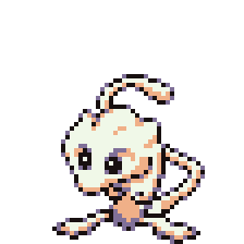
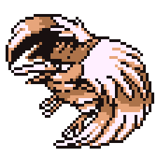
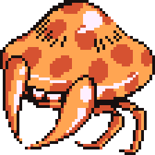
I guess but that Mew Sprite tho...I think that something can be both off model & ugly
I find that blastoise & machoke sprite extremely ugly, for example.
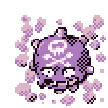
Meanwhile i think Fearow & Koffing are ok.
So I hate the Red/Blue sprites too. The sprites in Yellow however, they're amazing. The back sprites are still the same, but the front ones are so much more improved over R/B.We can agree that Gen 1 (Pokemon Red and Blue) had the worst Sprites of all of Pokemon and created by Game Freak lolol
http://pkmn.net/?action=content&page=viewpage&id=8544
Like almost every Gen 1 Sprite had something weird about it..
Probably why my Friend doesn't like RBY so much, I don't blame him tho View attachment 393933
Discord: 00Crystal#7683
Fair, Yellow does have better sprites than Red and BlueSo I hate the Red/Blue sprites too. The sprites in Yellow however, they're amazing. The back sprites are still the same, but the front ones are so much more improved over R/B.
Koffing is okay... except the skull and crossbones are in the wrong place.I think that something can be both off model & ugly
I find that blastoise & machoke sprite extremely ugly, for example.
Meanwhile i think Fearow & Koffing are ok.
Fearow however is just... confusing. Unless you saw it in the anime or in promotional art I'm 100% no one who saw that sprite on a little Gameboy screen had any idea what Fearow actually looked like.
Even now I'm having trouble identifying what I'm looking at lol. Compare it to yellow.
Now that's a Fearow.
Last edited:
Makes sense, its supposed to be a Bird but Game freak didn't show that.Koffing is okay... except the skull and crossbones are in the wrong place.
Fearow however is just... confusing. Unless you saw it in the anime or in promotional art I'm 100% no one who saw that sprite on a little Gameboy screen had any idea what Fearow actually looked like.
Even now I'm having trouble identifying what I'm looking at lol. Compare it to yellow.
View attachment 394124
Now that's a Fearow.
It's a bird either in midflight (the wings are coming down for a flap) and its pulled the head a bit in and up. It reads fine as a fearow to me.Koffing is okay... except the skull and crossbones are in the wrong place.
Fearow however is just... confusing. Unless you saw it in the anime or in promotional art I'm 100% no one who saw that sprite on a little Gameboy screen had any idea what Fearow actually looked like.
Even now I'm having trouble identifying what I'm looking at lol. Compare it to yellow.
View attachment 394124View attachment 394126
Now that's a Fearow.
or it's on the ground and sort of "puffing" itself up. Positioning the wings to make it look large and pulling the head in so it blends with the fluff.
It's still a bit off model (the perspective on those wings are something else) but I don't think I'd ever be confused at what I'm looking at.
Fair.Also most sprites were made BEFORE the art, and trying to compare 90s Gen 1 to post Gen 3 art is stupid
Though worth noting the gen 1 timeline for this isAlso most sprites were made BEFORE the art, and trying to compare 90s Gen 1 to post Gen 3 art is stupid
Green Sprites
First set of Artwork (these are the ones you might see in a few guides here & there and generally seem more "on model" and static)
Blue Sprites (these are the ones we got)
Second set of Artwork (these are the "actiony" ones we got in our guidebooks)
Yellow Sprites
Yellow Artwork (the static, clean poses)
I'd say it wasn't until approximately Yellow/Anime/Full Worldwide Phenomenon where things started getting more ironed out for consistency. Blue being off model is probably just a hold over from not fully committing to a set design to begin with. Just a real wild west of inconsistency until they basically sat down and went "okay, we need to have a set design to base these off of so we're not jus free wheeling in every single thing we do from now on" something you can see them starting to adhere to even in early builds of GS before the massive overhaul.
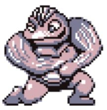
Anyway regardless of on model, off model or no model at all that Machoke sprite is ugly as sin.
Though worth noting the gen 1 timeline for this is
Green Sprites
First set of Artwork (these are the ones you might see in a few guides here & there and generally seem more "on model" and static)
Blue Sprites (these are the ones we got)
Second set of Artwork (these are the "actiony" ones we got in our guidebooks)
Yellow Sprites
Yellow Artwork (the static, clean poses)
I'd say it wasn't until approximately Yellow/Anime/Full Worldwide Phenomenon where things started getting more ironed out for consistency. Blue being off model is probably just a hold over from not fully committing to a set design to begin with. Just a real wild west of inconsistency until they basically sat down and went "okay, we need to have a set design to base these off of so we're not jus free wheeling in every single thing we do from now on" something you can see them starting to adhere to even in early builds of GS before the massive overhaul.
Anyway regardless of on model, off model or no model at all that Machoke sprite is ugly as sin.
I know right..
An Aside, I feel like most of the bird sprites (from gen 3-5 were pretty ANGRY looking.
I don't know where to find them
This is directed mainly towards pidgey, swellow, starly evo lines)
I think we're due for some "happier" bird sprites, no?
I don't know where to find them
This is directed mainly towards pidgey, swellow, starly evo lines)
I think we're due for some "happier" bird sprites, no?