CAP 10 CAP 10 - Art Submissions

Status
Not open for further replies.
so, I have another concept i want to get out there; this time with more obvious water type association, as apposed to my water buffalo concept.


(Bad colouring job, just done to show a possible scheme)

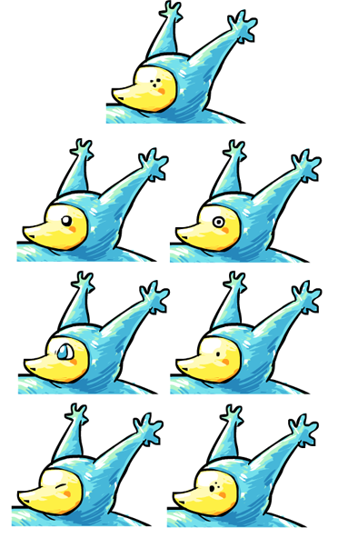
it's based off a Knifefish, an Oarfish, and generic bioluminescent fish. Knifefish (which is technically what an Electric Eel is. /fun fact) use electric discharges for various purposes, which I guess I can weasel into classifying as utility oriented...

Also some critique.

@Wyverii: overall I like the design. I originally passed it over, but the supporting material caused it to grow on me a little. if possible, I would add some sort of electric element to it, just to emphasize it's typing more. currently it's looking more Ice/Water than Electric/Water. thats not really a flaw, though. I give it 7/10, taking my personal aesthetic preference into consideration; 8.5/10 without.
 
Final Submission:

Hey everyone. I really like a lot of the ideas here, especially Cartoons! Rocket Grunt,
Keishinkae, and Aragornbird. Great stuff! Also, here's an idea of my own:


what do you think?
 
@ Galactic Grunt: Ah, yes, I remember this fellow from before. I think I said something about him earlier too...

Anyways, I would have to say that that blue color doesn't look very good. Something about it is making me go "meh." Looking at the earlier color schemes, I'd say that I kinda see the aquamarine the most: if I am not mistaken, I envisioned that color when I saw your initial design. And, yes, back is beautiful. I'd say go with either one of those two color schemes.

Thank you! I think he looks pretty awesome in any palette, but I figured I'd do some supporting material here with the color you suggested:

http://img714.imageshack.us/img714/4257/puuunch.jpg

Doing a Volt Tackle would be harder to draw, but c'mon, given Gyarados's size (+ Intimidate) I think STAB Thunder Punch-ing him would be a million times more epic. YEH!
 
Hey everyone. I really like a lot of the ideas here, especially Cartoons! Rocket Grunt,
Keishinkae, and Aragornbird. Great stuff! Also, here's an idea of my own:

http://www.kodiakber.net/forumpost/cap10small.png

what do you think?
Very nice. :3 I like how you were able to convey something concievably both water and electric without abusing blue and yellow in your color scheme. However... its pose is a little confusing. It's... a stingray, right? I'd suggest showing it from a mostly top view to demonstrate that.

Also, nice sketch, GG. =)
 

SJCrew

Believer, going on a journey...
is a Tiering Contributor Alumnusis a Battle Simulator Moderator Alumnus
Doing a Volt Tackle would be harder to draw
Have you watched or played a game of football before? All you need to do is keep him in that exact pose, move him a little closer, and it looks like a tackle.
 
@Nyasu: That's pretty awesome, if I must say, but the Swampert feel is still slightly there, I'm afraid. Other than that, I can see the electric typing, and it's a unusual way to use the almost guaranteed "Blue/Yellow" colour design, as your blue is certainly related to electric types as well as water types.

@Wyverii: I disagree with the thoughts of others: if we go by appearance alone, why is Blaziken a Fire/Fighting? It's a bird for crying out loud: and even Doduo, a Dodo, is a Flying type. I can see with the Electric type, but if we just called it a Bear, rather than a Polar Bear, all the arguments become invalid.
I mean, honestly, we're denying a cool-looking concept because Wyverii based it on a Polar Bear, which is simply a cooler version of a Bear. There is no ice typing in the design whatsoever, as white is a form of light, and lightning is both a form of electricity and light. There, I've destroyed the only reason against this design.
I love your design - it has a unique feel to it and is also one of the only non-sea/water based concept in the bunch - which, to be honest, is the right way to go with CAP10 - we're designing a Electric typed Pokemon with a secondary Water typing. Not the other way around.
 
thanks for the help sezja, you were right
heres what the first design looks like with what you suggested
but like supernes said, it looks like i made a ghost or rock type now
i could try to recolor it like a lightbulb but instead i remixed the shape
just trying to make it look more like a battery/broken fuse/florescent bulb/dunkleosteus haha
so this is what i came up with
again im not too sure about the colors

-snip-

(uncolored version here)

thank youu
I would so vote for that. It really gets the type across. Doesn't really convey steel at all. It almost matches the stat spread too.
 
Welcome back, Zant. Good to see you in the races.

I did a little schema of the head using some stock Pokemon eyes to see if anyone feels better about my design's eyes. I'm partial to the bottom right version which most closely resembles my original idea of the 'primitive spotted' eyes while hopefully making it more personable and cute at the same time.


There are a lot of selections there so I'm not expecting anyone to pick out a favorite eye or anything, but it would be helpful to know if people are comfortable with the original eye design or not in light of these other examples given.
 
Zantimonius: I like it! It's very interesting-looking. My only criticism is that it seems a little slight on the 'electric' side, which might be problematic since CAP10's main type is Electric. By and large though it's very good.

Wyverii: You never cease to impress. Love it even more than the original. I like the change to the blue lower body, and especially the plasma/electric blue hue you chose. For the people who complain about polar bears being to "icy" well...they just don't get it. I also like how it seems to combine the feel of "bulky" and "speedy." I'd imagine your polar bear able to take hits and quickly respond with a few smacks of its own, and it looks physically capable of doing some damage. As stated above, yeah, flavor isn't the project's primary concern, but as far as the art goes I think it applies.
I dig the supporting art--it really helps solidify the "zomg this thing is BIG" factor. Any more you've got would be awesome!

Nyasu: Very nice! Main crit here is the, as you put it, "super crappy coloring job of fail." :P The shape and design is great, though; I just...don't care for the blaring eye-watering turquoise body. Perhaps something a little more demure? Maybe an azure (halfway between cyan and blue on the RGB color wheel) would work better, but it seems that you already know what else needs fixing.

Bucky: Very interesting! I love the polished look of the final design. Great job.

Keishinkae: I'm definitely digging the electro-gator. Or would it be electro-dile? :P Either way, it's a strong concept and drawn well. Overall I favor the bulkier side, though I definitely think keeping a balance between bulky and gracile build is important. As I said earlier, CAP10's stats say it can take a beating and move relatively swiftly around the battlefield.
Would be very cool to see some more supporting art!

DarthVader317: Love it! Salamanders are among my favorite watery creatures, so I'm always in favor of adding a few more anywhere, and you've done a very good job drawing one. You might want to consider a pale blue, pale yellow, or some combination thereof for the body color (maybe pale blue with yellow spots?) to emphasize both types at once. Definitely digging the axolotl-like gills. Keep up the good work!
 
I'm rather fond of the original set of eyes Cartoons. As eyes typically express emotion and thought processes, the unreadable eyes of your original design give an air of unpredictability that's well suited for this concept. Plus, it's a weird feature that serves to make your entry more memorable.

Out of the six alternatives though, I rather like the bottom left for the same reasons I prefer the original eyes. Bottom right looks pretty cool too.
 
Made some anatomy edits to my guy, along with a SUPER CRAPPY COLORING JOB OF FAIL™!!! 8D

http://img138.imageshack.us/img138/3883/cap10.png

*Cough*, anywho, I made him overall a lot more mammalian to hopefully distinguish him from Swampert, with cat-like ears and hind legs. Palette is very subject to change, but I liked the idea of a primarily blue-while coloring, as that's not too common among Electric-types (Pachirisu comes to mind). I gave him what looks almost like circuitry along the fingers; I see it as using this to channel electricity into other parts of its body (will probably add more going up the arms and leading down the legs.

He's still under heavy revision, so any comments are appreciated! :)

~Nyasu
I totally overlooked this one but I must say it's by far my favourite so far. One small comment, that could be just me, though, but in this picture specifically, it kinda looks like as if the fin on it's back is something attached to his arm, like a wing, yet the other arm misses it. Again, maybe it's just me. The coloring is great, I love the blue and white scheme. If you do consider different palettes, don't stray too far from what you already have. Anyway, amazing concept so far, I'm very curious to see where this one will go.
 
Welcome back, Zant. Good to see you in the races.

I did a little schema of the head using some stock Pokemon eyes to see if anyone feels better about my design's eyes. I'm partial to the bottom right version which most closely resembles my original idea of the 'primitive spotted' eyes while hopefully making it more personable and cute at the same time.

<snip>

There are a lot of selections there so I'm not expecting anyone to pick out a favorite eye or anything, but it would be helpful to know if people are comfortable with the original eye design or not in light of these other examples given.
Squinty eyes! They fit the character so well.
 
@ Toons! Honestly, I was never very fond of the eyes, but looking at the alternatives, I don't really like any of those either, LOL. However, I thought about what Scampy said about your original eyes being an expression of his ambiguity as a counter, and based on that, I think you should stick with the original eyes. That feeling of uniqueness and memorability is definitely good to have.

Well, here goes. It's based off an electric eel and a mudpuppy. It's tail is its primary means of attacking and allows it to jolt forwards quickly. The electric charge in its body gives its eyes a luminescent glow.
http://fc03.deviantart.net/fs70/f/2010/083/1/8/Rawr_by_invaderscandal.jpg
Wow, I somehow completely missed this one. =0

I have to tell you, I really like the idea, but I'm getting a strong feeling of an NFE Pokemon from this. I really like the design of the limbs and tail, but I think you should try to incorporate all his great features onto something that looks a little more physically mature, you know? =0 That's what I think, anyway. That aside, I think this is probably the best concept for a newt or amphibian Pokemon that anyone's put up, with the slight possible exception of Darkmattr's armored newt thing.
 
I agree with Banryu about this one. He looks like the most BAMF prevo ever but I'm okay with that. I like it as is but if you decide to 'mature' it I'm sure it will still be amazing.

Cartoons: The eyes will work the way you had them. I have seen a ton of people listing yours as their favorite without changing them. Just use whichever ones you are the happiest with. It is going to do well regardless I think. (I like your originals and the bottom right best though...)
 
cartoons I like the bottom two eyes, though I would still vote for yours with your little 3 dot pattern thing you have going on there now.
 
i really like Wyverii's concept, the only problem though is that it doesn't look like a water type, it feels more like an ice type even though everything about the design feels right with the stat distribution (it's big but it's also fast)

the argument with blaziken was that he's a bird but isn't flying type, the thing is though, when you look at him, he doesn't look flying type, he looks like something that could lay the beat down that also happens to be on fire

so, i'm saying, this thing needs a water appeal to it, and wyverii's design sadly doesn't bring that, it instead brings an ice appeal

there are a couple oddballs though, like gyarados (it's water/flying when it looks like water/dragon), drapion (it's poison/dark when it looks like a bug), most levitating pokes with wings (they look part flying but aren't)

we can't explain them but at we come to accept them
sadly, when we think of electric/water we think of an angler and most people are trying to get around it since lanturn already exists, which is a very good thing

wyverii, i'd keep that concept design you have there, it's friggen badass, you could change around the color to make it seem more water-like (the white fur really makes it ice-like), but you hit the pokemon feel spot on with that one
 
I agree with Banryu about this one. He looks like the most BAMF prevo ever but I'm okay with that. I like it as is but if you decide to 'mature' it I'm sure it will still be amazing.
Wow, I somehow completely missed this one. =0

I have to tell you, I really like the idea, but I'm getting a strong feeling of an NFE Pokemon from this. I really like the design of the limbs and tail, but I think you should try to incorporate all his great features onto something that looks a little more physically mature, you know? =0 That's what I think, anyway. That aside, I think this is probably the best concept for a newt or amphibian Pokemon that anyone's put up, with the slight possible exception of Darkmattr's armored newt thing.

Wow thanks soooo much you guys! I'm considering "maturing" it up a bit, but I'm not sure just yet.
 
i really like Wyverii's concept, the only problem though is that it doesn't look like a water type, it feels more like an ice type even though everything about the design feels right with the stat distribution (it's big but it's also fast)

the argument with blaziken was that he's a bird but isn't flying type, the thing is though, when you look at him, he doesn't look flying type, he looks like something that could lay the beat down that also happens to be on fire

so, i'm saying, this thing needs a water appeal to it, and wyverii's design sadly doesn't bring that, it instead brings an ice appeal

there are a couple oddballs though, like gyarados (it's water/flying when it looks like water/dragon), drapion (it's poison/dark when it looks like a bug), most levitating pokes with wings (they look part flying but aren't)

we can't explain them but at we come to accept them
sadly, when we think of electric/water we think of an angler and most people are trying to get around it since lanturn already exists, which is a very good thing

wyverii, i'd keep that concept design you have there, it's friggen badass, you could change around the color to make it seem more water-like (the white fur really makes it ice-like), but you hit the pokemon feel spot on with that one
I disagree that Wyverii's thing looks more like an Ice-type.... I think the fact that his paws are blue is enough to demonstrate that it's Water-type in part. =0

I also think you brought up some important points, with Blaziken for sure but also with the others. I think the most notable example of this is (my favorite xP) Flygon. When I first saw him, my brain said 'Bug-Flying'. Dragon-Ground is the last thing I expected him to be. x___x This is an extreme example, but it holds the point that something doesn't need to look precisely like the type it's designed to be.
 
Nyasu: Very nice! Main crit here is the, as you put it, "super crappy coloring job of fail." :P The shape and design is great, though; I just...don't care for the blaring eye-watering turquoise body. Perhaps something a little more demure? Maybe an azure (halfway between cyan and blue on the RGB color wheel) would work better, but it seems that you already know what else needs fixing.
Well surely you didn't think I was gonna keep the five minute coloring job (Which I made while in the middle of class)? x3 As far as the color palette, I can see how the turquoise could be obtrusive. I was mainly trying to avoid Swampert's shade of blue, and going darker wouldn't feel very electric-y. I've toned down the hue/saturation a bit this time, but not much. If you still think it's over-the-top, I could try altering it some more.
I totally overlooked this one but I must say it's by far my favourite so far. One small comment, that could be just me, though, but in this picture specifically, it kinda looks like as if the fin on it's back is something attached to his arm, like a wing, yet the other arm misses it. Again, maybe it's just me. The coloring is great, I love the blue and white scheme. If you do consider different palettes, don't stray too far from what you already have. Anyway, amazing concept so far, I'm very curious to see where this one will go.
Yup, I had already started on my final illustration and had noted that I drew the fin incorrectly.


Well, here's what I've got so far, and it's pretty much done, ruling out any edits that I might make.

Still trying to think of more ways to get rid of the Swampert feel... If all else fails, and you guys think he's too derivative for his own good, I can change his face to make him a mammal full-out. (Although I think a mammal nose on him would look a bit silly.)


His lower body is sufficiently original, it's just the upper body that I have to worry about.

~Nyasu
 
Here is a front view of my design. I'll be gone for the weekend so I won't be able to add anything else until Sunday.


What do you guys think?

Here is the same pokemon in a different pose.


And here he is using another attack on a poor Dragonair.

 
Well surely you didn't think I was gonna keep the five minute coloring job (Which I made while in the middle of class)? x3 As far as the color palette, I can see how the turquoise could be obtrusive. I was mainly trying to avoid Swampert's shade of blue, and going darker wouldn't feel very electric-y. I've toned down the hue/saturation a bit this time, but not much. If you still think it's over-the-top, I could try altering it some more.

Yup, I had already started on my final illustration and had noted that I drew the fin incorrectly.


Well, here's what I've got so far, and it's pretty much done, ruling out any edits that I might make.

Still trying to think of more ways to get rid of the Swampert feel... If all else fails, and you guys think he's too derivative for his own good, I can change his face to make him a mammal full-out. (Although I think a mammal nose on him would look a bit silly.)

<snip>

His lower body is sufficiently original, it's just the upper body that I have to worry about.

~Nyasu
Urgh... your lineart is too good... I'm struggling with mine. I really like your design
 
Status
Not open for further replies.

Users Who Are Viewing This Thread (Users: 1, Guests: 2)

Top