
So I play showdown a lot with the browser window size decreased which forces the in-battle chat behind a button. The thing is, this button is very small and is a minor inconvenience to click, especially since I want to see the chat very frequently. Originally, I was gonna ask if a button on the mouse could be used to switch to it, but I realized that that is probably to complicated. Instead could the button be made bigger, ideally using this space I drew around in red
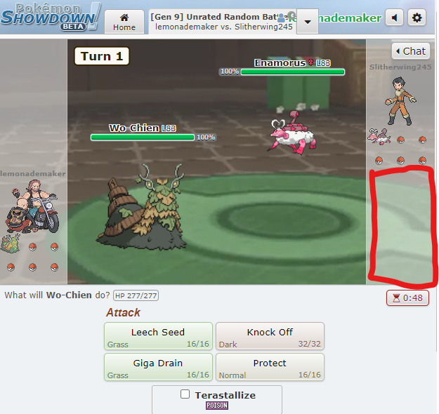
This space isn't being used for anything and it would be nice if it had a better purpose. The only problem I could see this cause is taking up the space for mons in customs battles with more then 6 mons. But this can be easily fixed by the button reverting back to its current state if the site the detects a battle with either player having more then 6 mons.
I know this is a very minor thing but it would be pretty nice to have, thanks.
(Also, this would help in the mobile version where chat is always beyond the button, but I never play the mobile version so this post isn't about it)
Last edited:


