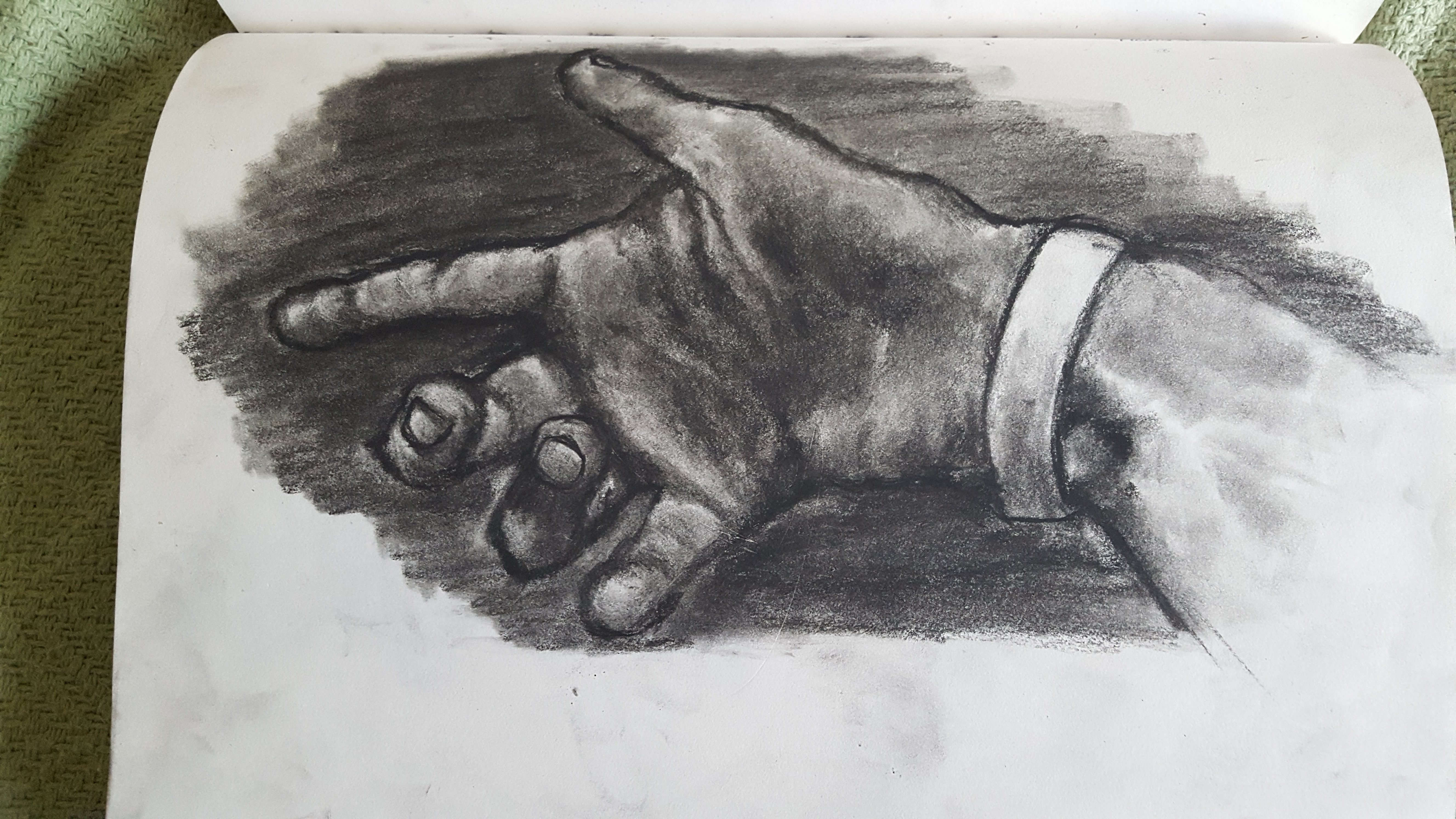
Hello, everyone I am HanSoloIndie! I finally created enough art to post on a forum to show my art to everyone!
My twitter is https://twitter.com/IronFe7

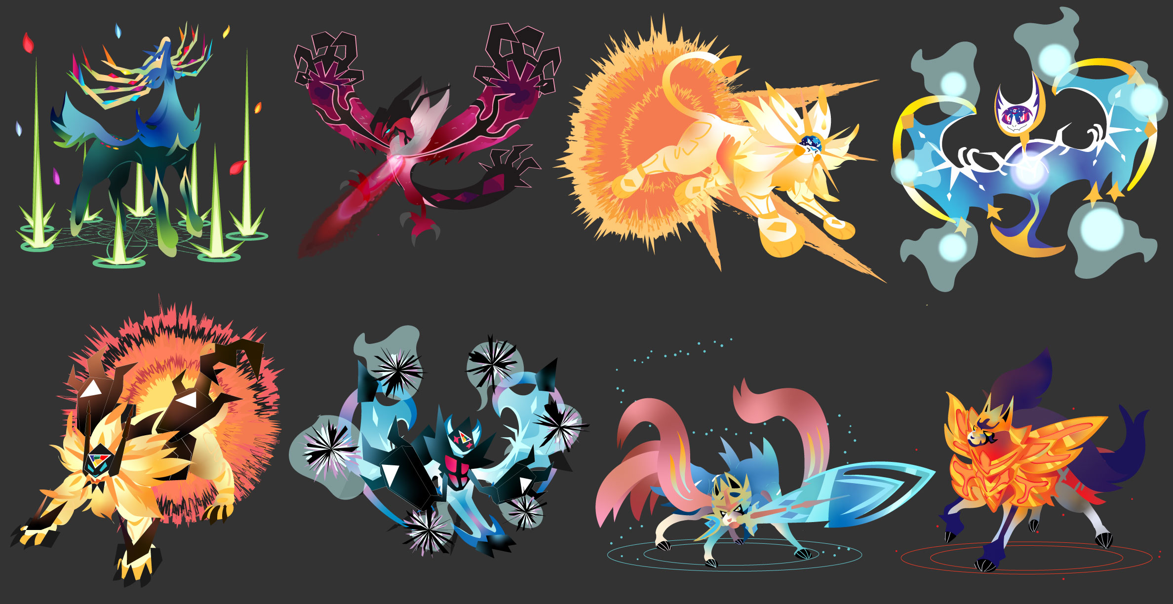
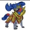
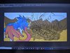
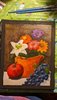
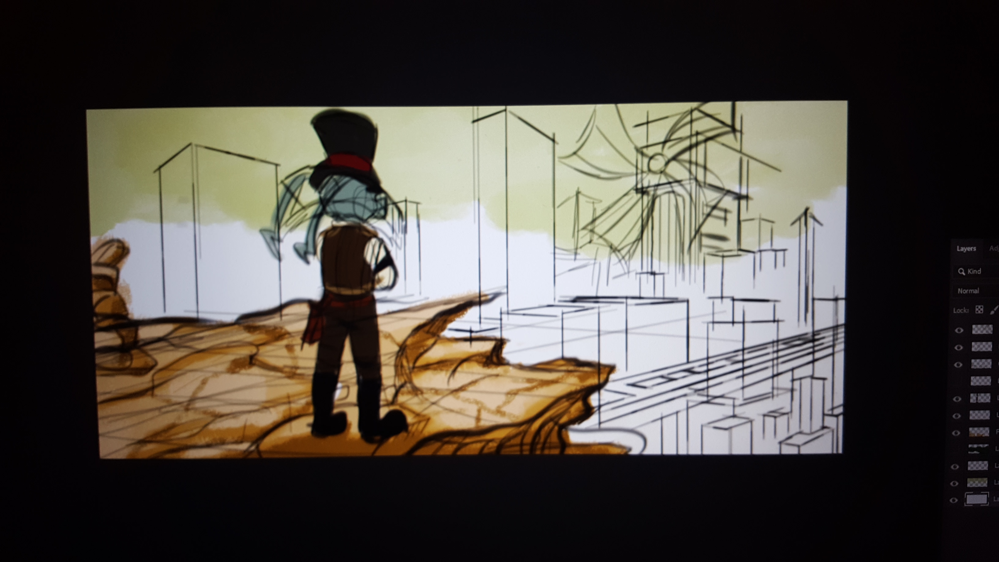
This is a sample of a bigger project.
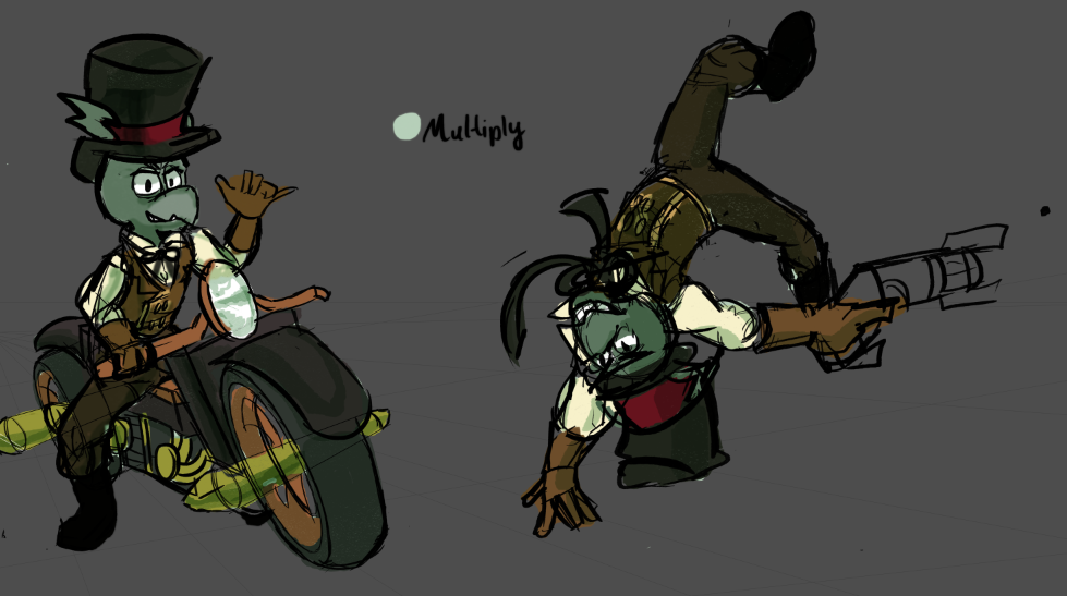
(My orginal character, Paraphernalia, as part of a steampunk story I am working on)
Since credit is due and to help any aspiring artists in this thread, here is a list of resources that is open to everyone for Photoshop/Illustrator etc. that I used. As long as you are not redistributing them as your own/sharing download links, you can use these without asking permission/give credit (although that would be polite) in (some cases) commercial/non-profit works. These are not mine, they are third parties.
My twitter is https://twitter.com/IronFe7
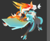
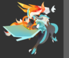
This is a sample of a bigger project.
(My orginal character, Paraphernalia, as part of a steampunk story I am working on)
Since credit is due and to help any aspiring artists in this thread, here is a list of resources that is open to everyone for Photoshop/Illustrator etc. that I used. As long as you are not redistributing them as your own/sharing download links, you can use these without asking permission/give credit (although that would be polite) in (some cases) commercial/non-profit works. These are not mine, they are third parties.
https://blog.spoongraphics.co.uk/freebies/download-free-felt-craft-kit-adobe-photoshop
https://www.deviantart.com/deharme/art/Photoshop-Brushes-Deharme-OIL-SET-Photoshop-CC-707869840
https://www.deviantart.com/zummerfish/art/Zummerfish-s-Acrylic-Brushes-for-Photoshop-456291397
https://www.brusheezy.com/brushes/1792-free-hi-res-watercolor-photoshop-brushes
https://www.deviantart.com/deharme/art/Photoshop-Brushes-Deharme-OIL-SET-Photoshop-CC-707869840
https://www.deviantart.com/zummerfish/art/Zummerfish-s-Acrylic-Brushes-for-Photoshop-456291397
https://www.brusheezy.com/brushes/1792-free-hi-res-watercolor-photoshop-brushes
Attachments
-
 2.4 MB Views: 401
 -
 608 KB Views: 382
Last edited: