(Please take note that this OP is severely outdated due to a lack of time to fix it up)
Pokemon Showdown! looks pretty nice with the small menu sprites of the 3DS era in my opinion. Such a look wouldn't exactly be feasible as of now however, because fully evolved Pokemon get cool-looking larger menu sprites that wouldn't work with the Showdown! layout. (EDIT: they got some decent menu sprites as of right now. This is a "fun" project a of right now. Who knows however, they might get used in the future!) As a result, I got inspiration from this situation and felt like making attempts to downscale the larger menu sprites to an acceptable appearance. Keep in mind this is my first thread in this section of the forums and the content may not be the best, but here's what I have so far:
So how are they? Anything about the style I need to improve? Anything in general that could use improvements? Any Pokemon in particular you would like me to try?
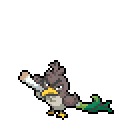
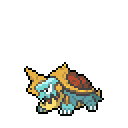
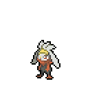
Corviknight Line:
 --->
--->

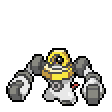
Down-scaling this sprite from a 96x96 canvas to a 40x40 canvas worked out really well. Most of the features made it in some way. (only manual work was adding in one little detail it didn't get and fixing the outline.) This ended up nice-looking.
 --->
--->

 --->
--->

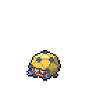
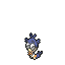
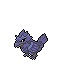
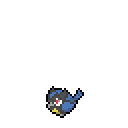
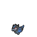
These two were already at the necessary size, so only thing needed was an outline recolor to match the Generation VII sprites
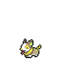
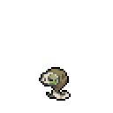
Applin Line:
 --->
--->

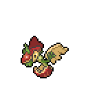
Down-scaling here also went well, but the wings were a bit deformed after the scaling, so after tiding that up, I got to this!
 --->
--->

The head seemed to flatten a bit when it was scaled. A little work there fixed that issue, and it's quite nice right now.
 --->
--->

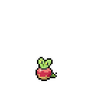
Applin was at an appropriate size, so down-scaling was a no brainer.
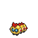
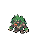
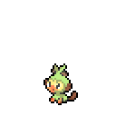
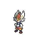
Rilaboom Line:
 --->
--->

Rilaboom also scaled nicely. I have a bit of concerns about the line of hair going through it's face, but it looks decent.
 --->
--->

 --->
--->

These two were a no brainer to get scaled down.
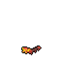
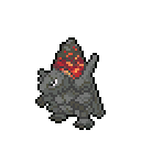
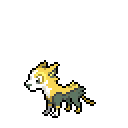
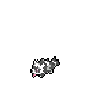
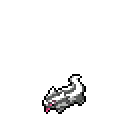
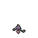
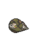
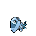
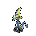
Arctovish:
 --->
--->

Acrtovish doesn't have a lot of features, so it scaled down quite nicely!
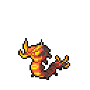
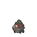
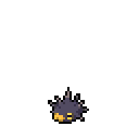
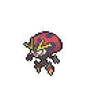
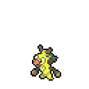
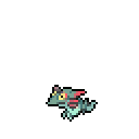
Dracozolt:
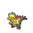 --->
--->

It scaled down really weirdly, and it was hard to identify what was the bolts and what was the yellow part of the body. Not a fan of this one personally.
But all of this seems so easy so far! What down-scaling actually took work to do?
Basically, some of the Pokemon required more than a simple scale to get:
Intelleon Line:
Simply scaling Intelleon down resulted in a really tall-looking sprite:
 --->
--->

You can't tell me that isn't way too tall-looking. As a result, I did more than downscale:
Specifically, I cut off a good portion of the head frill, slightly shortened the head, cut off a bit of the neck, and slightly shortened the feet. It resulted in:
--->

It looks a bit crammed, but it's not as tall as it used to be now!
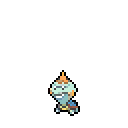
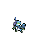
Sobble and Drizzile were trivial:
 --->
--->

 --->
--->

Cinderace Line:
Once again, I had ran into a Pokemon who looked too tall when initially scaled:
 --->
--->

So here, I cut off parts of the ears, removed a slight part of the neck, and moved the feet up a bit:
--->

Resulting in something that looked pretty nice.
The fun part about this line is that I actually edited Scorbunny and Raboot:
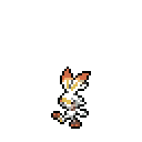 --->
--->

 --->
--->

Specifically, Scorbunny's ears are slightly smaller, while Raboot's hair ruffs and legs are slightly smaller.
Dragapult Line:
This time however, the specified Pokemon ended up too wide instead:
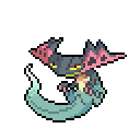 --->
--->

That looks wide doesn't it?
So to combat that, the head fins were slightly shortened, a good chunk of the tail was removed, and the cannons were made slightly shorter:
-->

Dreepy and Drakloak were trivial:
 --->
--->

 --->
--->

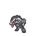
Eternatus:
Oh boy is the source image huge:
 --->
--->

The result looks really big, but Eternatus itself appears to be really big, so I was ok with the sheer size.


Down-scaling this sprite from a 96x96 canvas to a 40x40 canvas worked out really well. Most of the features made it in some way. (only manual work was adding in one little detail it didn't get and fixing the outline.) This ended up nice-looking.


These two were already at the necessary size, so only thing needed was an outline recolor to match the Generation VII sprites
Applin Line:


Down-scaling here also went well, but the wings were a bit deformed after the scaling, so after tiding that up, I got to this!


The head seemed to flatten a bit when it was scaled. A little work there fixed that issue, and it's quite nice right now.


Applin was at an appropriate size, so down-scaling was a no brainer.
Rilaboom Line:


Rilaboom also scaled nicely. I have a bit of concerns about the line of hair going through it's face, but it looks decent.


These two were a no brainer to get scaled down.
Arctovish:


Acrtovish doesn't have a lot of features, so it scaled down quite nicely!
Dracozolt:


It scaled down really weirdly, and it was hard to identify what was the bolts and what was the yellow part of the body. Not a fan of this one personally.
But all of this seems so easy so far! What down-scaling actually took work to do?
Basically, some of the Pokemon required more than a simple scale to get:
Intelleon Line:
Simply scaling Intelleon down resulted in a really tall-looking sprite:


You can't tell me that isn't way too tall-looking. As a result, I did more than downscale:
Specifically, I cut off a good portion of the head frill, slightly shortened the head, cut off a bit of the neck, and slightly shortened the feet. It resulted in:

It looks a bit crammed, but it's not as tall as it used to be now!
Sobble and Drizzile were trivial:


Cinderace Line:
Once again, I had ran into a Pokemon who looked too tall when initially scaled:


So here, I cut off parts of the ears, removed a slight part of the neck, and moved the feet up a bit:

Resulting in something that looked pretty nice.
The fun part about this line is that I actually edited Scorbunny and Raboot:


Specifically, Scorbunny's ears are slightly smaller, while Raboot's hair ruffs and legs are slightly smaller.
Dragapult Line:
This time however, the specified Pokemon ended up too wide instead:


That looks wide doesn't it?
So to combat that, the head fins were slightly shortened, a good chunk of the tail was removed, and the cannons were made slightly shorter:

Dreepy and Drakloak were trivial:


Eternatus:
Oh boy is the source image huge:


The result looks really big, but Eternatus itself appears to be really big, so I was ok with the sheer size.
So how are they? Anything about the style I need to improve? Anything in general that could use improvements? Any Pokemon in particular you would like me to try?
Last edited: